Costanzos | Brand Positioning + Package Design
Food Brand Packaging Redesign: Elevating a Better-for-You Brand
the IN take
Occasionally we have the opportunity to contribute to the launch of a new product that not only delights consumers with its incredible taste but also brings them a significant nutritional advantage. It’s being on the forefront of innovations like these that make us feel truly inspired and grateful to be working in this dynamic industry.
opportunity
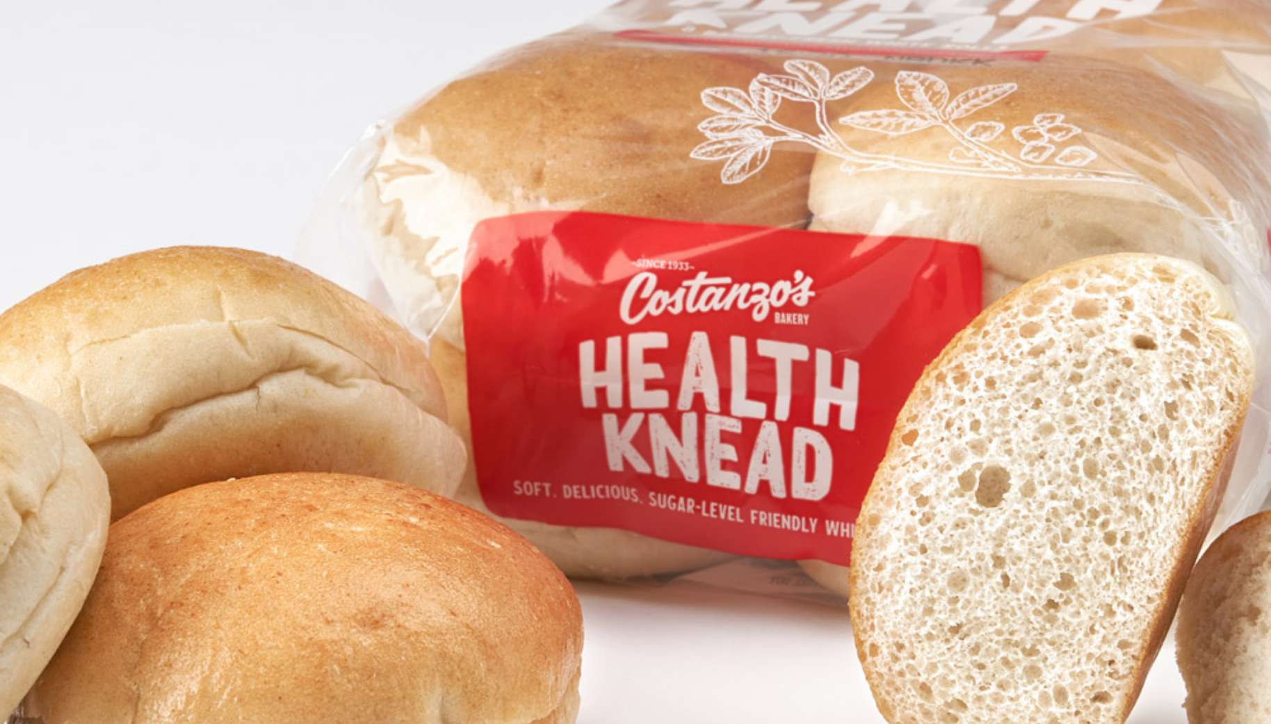
One such project came to us from Costanzo’s Bakery. They developed a delicious dinner roll that doesn’t spike blood sugar levels, ideal for consumers seeking a better-for-you option. The problem? When it was initially launched, the packaging relied on “low glycemic” language that was confusing to consumers.
approach
We developed a clear brand strategy and elevated packaging design that connect with consumers to efficiently communicate the modern advantages of the product while still highlighting the company’s rich heritage.
services
Competitive research
Brand positioning
Product naming
Package design
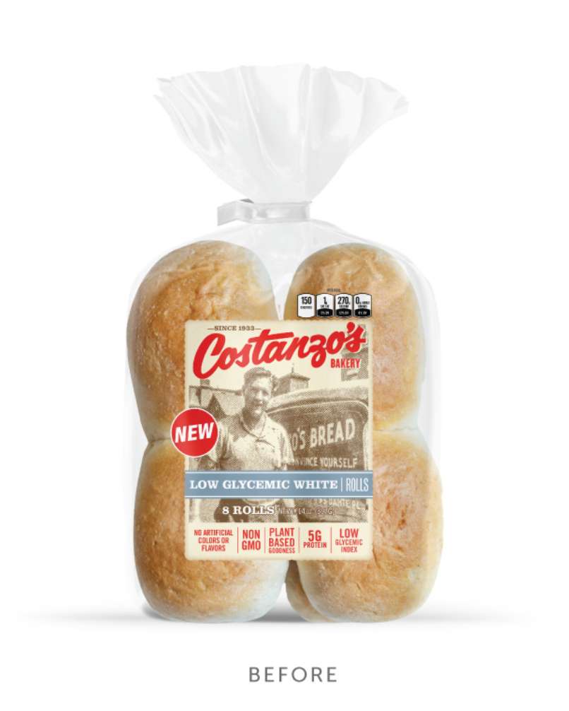
Establishing the Brand Persona and Positioning
We knew we were targeting consumers looking for tasty food options who didn’t want to sacrifice healthy blood-sugar levels. We recommended creating a sub-brand anchored with the Costanzo’s name that could communicate the key benefits and differentiation to shoppers. This foundation guided us toward four final concepts:
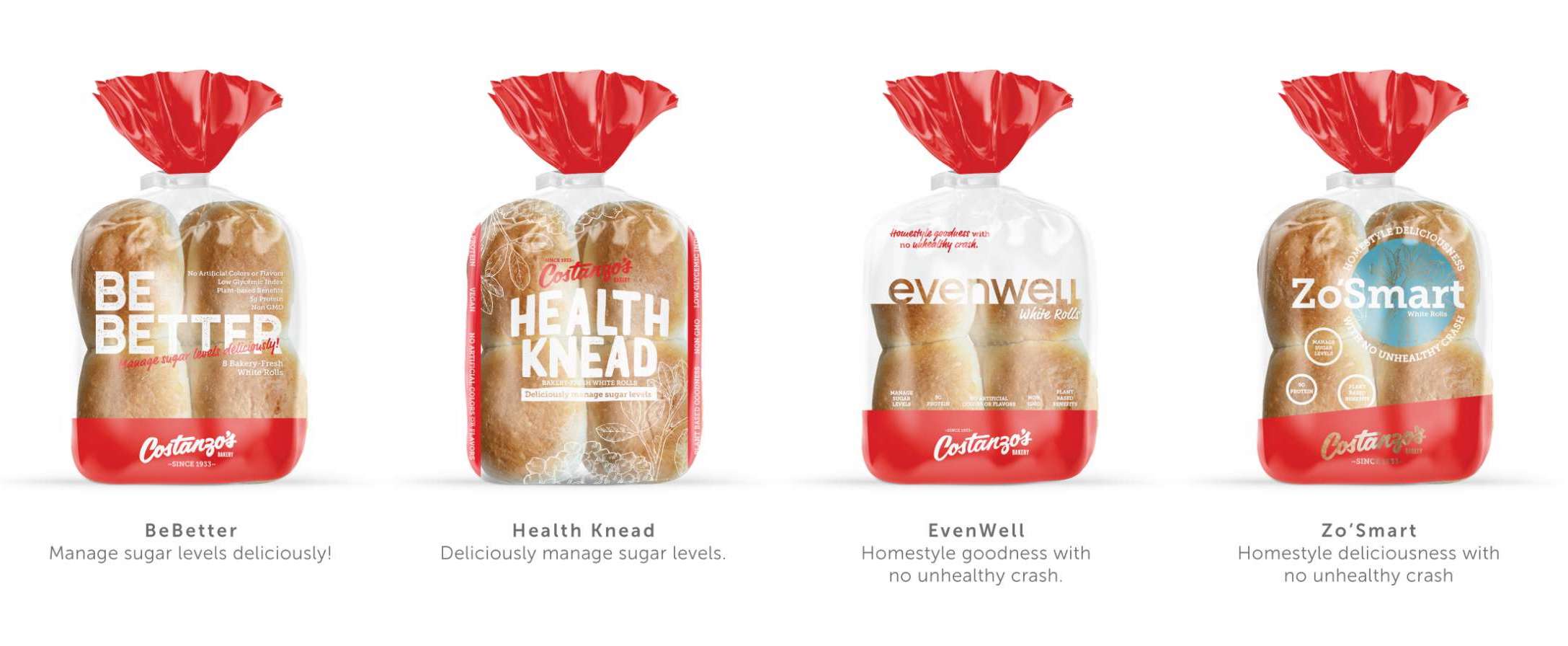

And Costanzo’s Chose…
The creative wordplay speaks to their unique blend that supports a healthy lifestyle while the tagline incorporates the high taste appeal. Details of the design incorporate the credibility of Costanzo’s (“Since 1933”) and retain the core Costanzo’s red. If you look closely and know your grains, you’ll notice fenugreek and other ingredient illustrations frame the corners to connect with the proprietary, plant-based blend.
