Buon Giorno | Package Redesign
Food Brand Packaging Redesign: Taking a Classic Brand Back to Its Roots
the IN take
In a category that places high emphasis on heritage, keeping pace with changing packaging trends can be a delicate balance. The label must communicate many elements at once: the history, flavor, and story behind the recipes — all while standing out on the grocery aisle shelf. It’s challenges like these we truly savor.
opportunity
The Buon Giorno Italia brand has a lot to celebrate. Their sauces are crafted from clean-label recipes perfected by the family’s grandmother in Casseta, Italy. With four varieties available, they’re beloved by a devoted following. However, to expand their reach and boost trial, a label update was needed for their jars to grab attention amid a dense marketspace of lookalikes.
approach
We worked closely with the brand to evaluate the competition, establish their messaging hierarchy, and explore various ways to appropriately convey everything their brand stands for. We think the work speaks for itself.
services
Competitive research
Label design
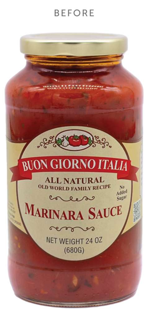
A classic brand in a crowded category
Even with its clean ingredient list and classic flavor indicators, the brand lacked shelf presence in a category with significant competition. An update was needed, but it also couldn’t seem out of place — looking too modern would belie its history.
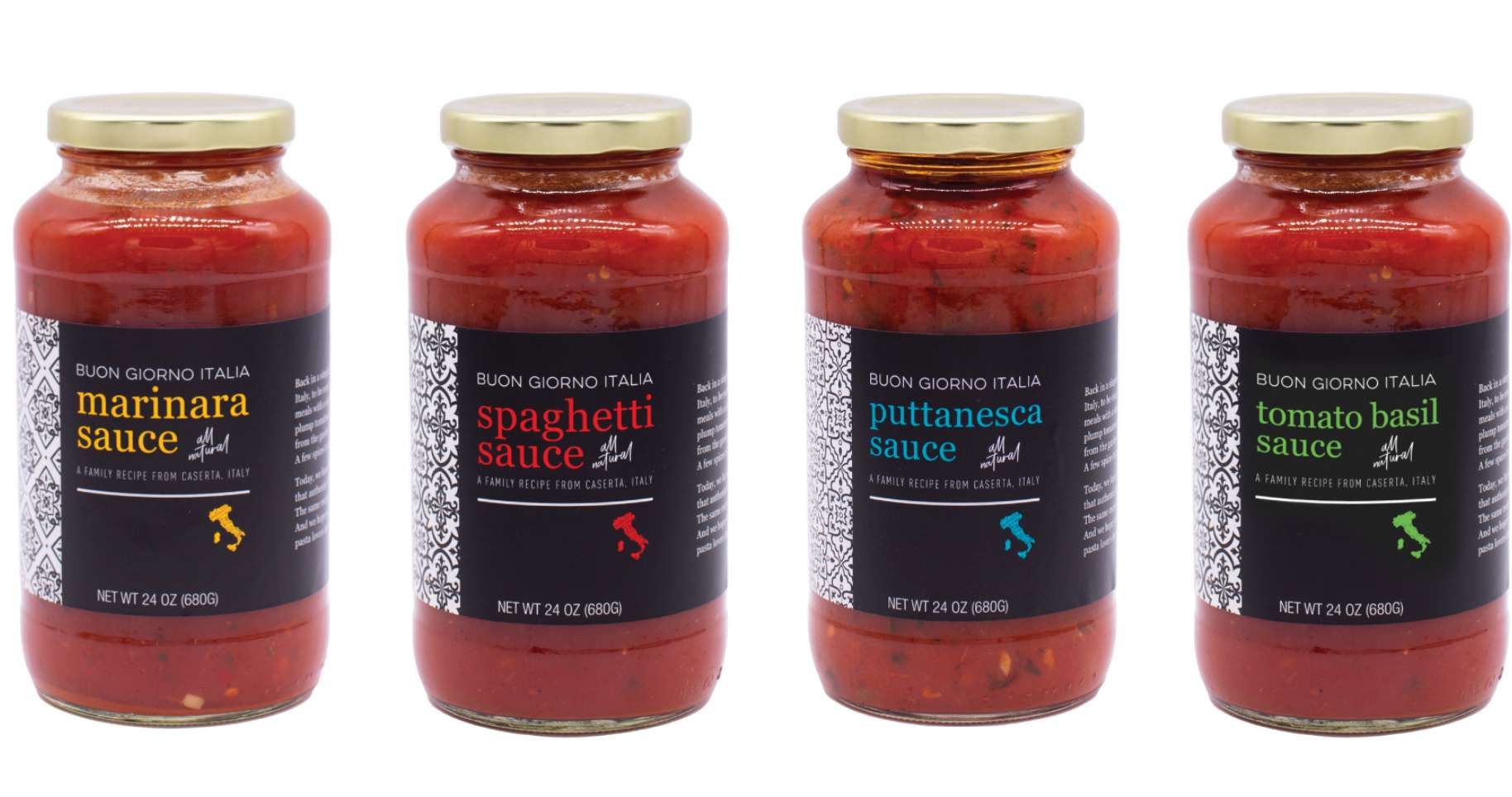
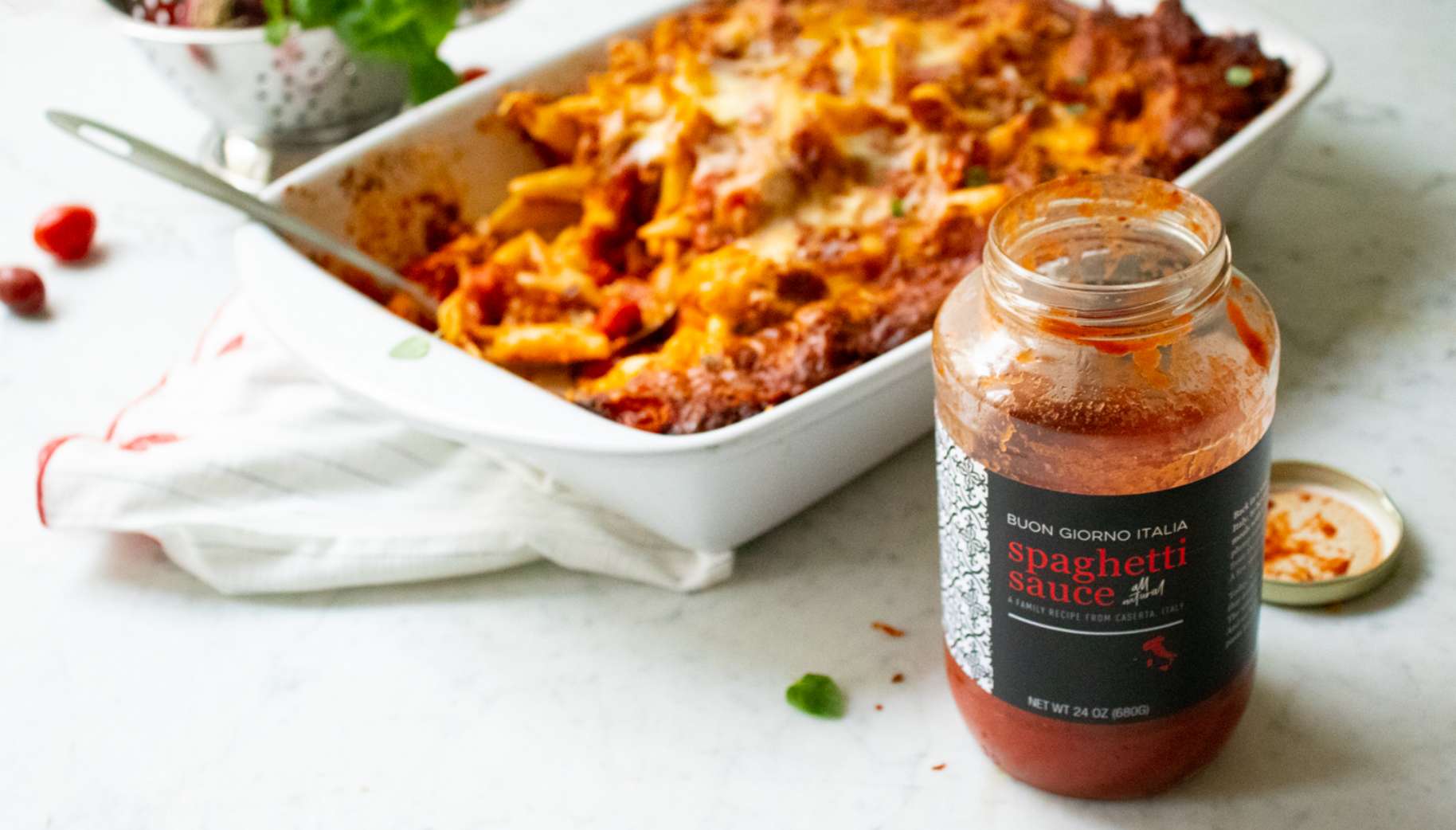
A fresh approach to stand out
By starting with a competitive audit, we found a “sea of sameness” in the colors, fonts, and approach many brands took. Through a dynamic design exploration, we developed a unique package composition that stands out on the shelf with a classic Italian pattern on a black background. It efficiently conveys the brand’s authentic heritage, simple ingredients, and a hand-crafted, small-batch feel.
