
The Cupboard Network | Logo Design
Branding for Neighborhood
Mini Food Pantries

the IN take
We often have the opportunity to develop and launch brands for large CPGs and are energized by the challenge of bringing a vision to life. So when given the opportunity to put our design expertise to work for a local start-up with an innovative idea for addressing food insecurity, we jumped at the chance.
opportunity
Develop a logo and visual identity system for The Cupboard Network, a host-powered network of neighborhood food cupboards designed to expand access to food while complementing existing hunger-relief infrastructure.
approach
The brand needed to communicate civic infrastructure, community-powered care, and dignified food access. It needed to be versatile enough to function on a physical cupboard in a neighborhood setting and scale across digital platforms, apparel, signage, and a future app — while feeling like the beginning of a movement.
services
Logo development
Brand guidelines
A brand worthy of the cause it serves
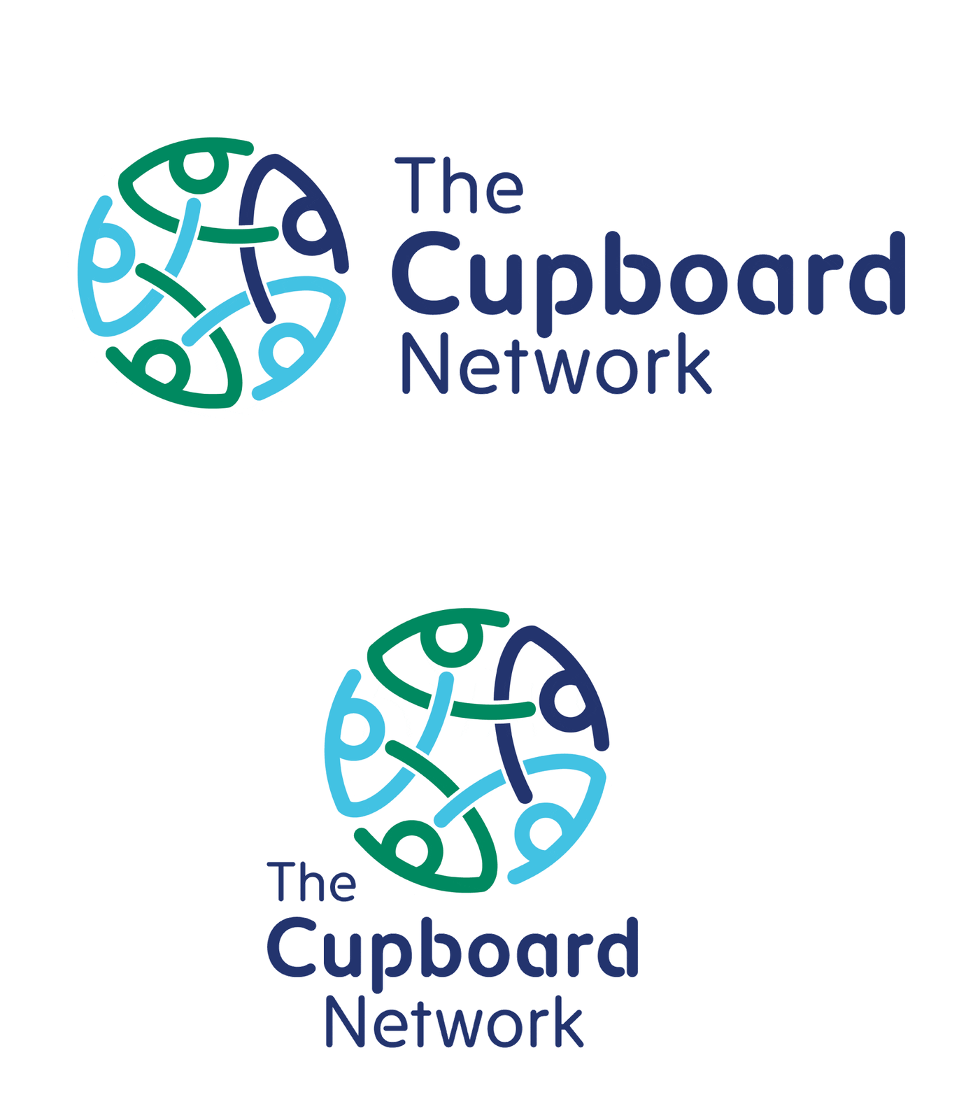
Inspired by the Allegory of the Long Spoons, the logo represents the idea that we thrive when we care for and support one another. Its interconnected forms evoke dignity, hope, community, and trust, reflecting the belief that shared resources and collective action can create meaningful change.

