As a food marketing agency, it’s hard for us not to ooh and ahh over some of the festive packages we see hit the shelves this time of year. Join us as we find and discuss the packaging for 12 food products dressed in holiday style.
Day 12: Land O’Lakes Eggnog
Our Notes
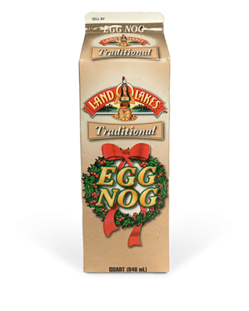
We couldn’t wrap up our series on holiday food packaging without taking a look at this seasonal eggnog from Land O’Lakes. Most of this carton has taken on a creamy tan background with a very subtle speckled texture. A simple red and green illustration of a wreath encompasses the product name and decidedly brands the package for Christmas.
Overall Thoughts
Like a few other products we’ve looked at for this holiday series, Land O’Lakes took a very simple approach with their eggnog packaging. There’s no product photography on the front. But, the creamy, speckled background hints at the beverage inside that’s traditionally sprinkled with nutmeg. As the singular element of Christmas on the package, the wreath appears stylistically retro, a nod to the nostalgia associated with this holiday party drink. The simple package design may not have a major “wow” factor, but it sure got us in the holiday spirit.
Day 11: Angie’s Frosted Sugar Cookie Boom Chicka Pop
Our Notes
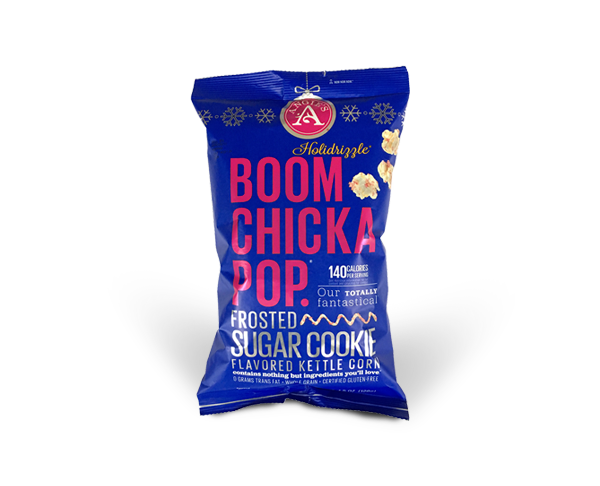
Here at IN, we have a soft spot for Angie’s, both for their popcorn and for their branding. Looking at just the layout of this holiday-edition bag, not much has changed from the standard packaging. Snowflakes have been added in a simple line at the top of the bag, and the logo has been transformed into a Christmas ornament. Known for their brightly-colored bags, Angie’s made the switch to metallic for their Holidrizzle packaging.
Overall Thoughts
Our eyes lit up like kids at Christmas when we saw the display of Angie’s Holidrizzle Boom Chicka Pop. Though the layout of this holiday-edition bag hasn’t changed much from the standard packaging, Angie’s has certainly made a festive impact with a simple switch to metallic for their Holidrizzle bags. Not only does this make the bags eye-catching among the other snacks on the shelves, but the metallic finish feels premium and special, a perfect fit for the Frosted Sugar Cookie Kettle Corn inside.
Day 10: Coffeemate Peppermint Mocha Creamer

Our Notes
The seasonal line of Coffeemate creamer received a wintry packaging makeover with a flurry of snowflakes falling in the background. For this Peppermint Mocha variety, a candy cane striped mug topped with decadent chocolate frosting and peppermint candy rests in the snowy white landscape to indicate the flavor inside.
Overall Thoughts
Though this packaging doesn’t scream “Christmas” or even “holiday”, its seasonal look can’t be missed in the snow and decadent drink displayed on the label. With this subtle approach, Coffeemate proves that not all limited-edition packaging needs to have an excess of bells and whistles to exude holiday spirit. Instead, their approach to seasonal packaging leverages their signature look to maintain brand recognition with just a taste of winter wonderland.
Day 9: Hershey’s Candy Cane Bar
Our Notes
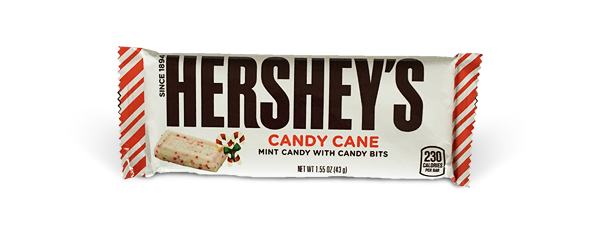
Hershey’s didn’t stray too far from its iconic simple packaging with their holiday edition Candy Cane bar. The wrapper features a clean, white design with candy cane stripes on both ends to indicate the bar’s peppermint flavor.
Overall Thoughts
Peppermint-flavored everything is everywhere during the holiday season. How is a brand supposed to stand out in all of that minty madness? Hershey’s took the “don’t reinvent the wheel” approach, and we think they made the right choice. By retaining their classic look with the simple addition of candy cane stripes, Hershey’s leveraged the strength of its brand to plow through the clutter.
Day 8: Trader Joe’s Dark Chocolate Covered Joe Joe’s

Our Notes
We couldn’t stay away from this seasonal treat from Trader Joe’s after hearing rave reviews from a couple of our team members. The box says “Christmas” at first glance with its 2-tone red striped design. It’s dressed up like a gift, as the design features a gold ribbon wrapping around the box. The badge-style logo even acts like a gift tag in a festive, ornamental shape.
Overall Thoughts
First thing’s first, we had to see if these cookies could live up to all of the hype. They definitely do, which posed a bit of a problem. The design has a holiday feel, but it doesn’t reflect the premium quality of the cookies inside. We think a gift-worthy product should have a gift-worthy presentation. Perhaps a cleaner, white design would better highlight the peppermint-y goodness of these decadent, yet refreshing cookies.
Day 7: Old Dutch Tiny Twists Holiday Pretzels
Our Notes
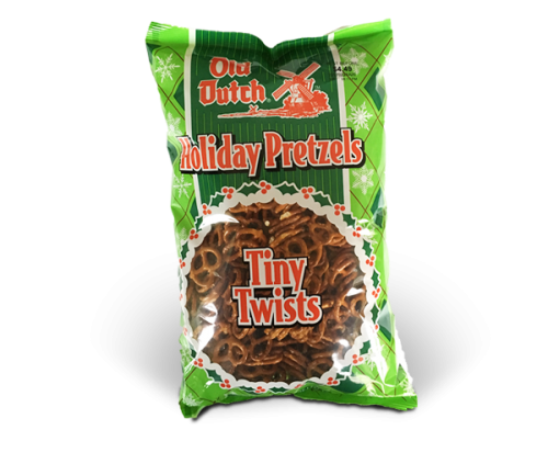
Nothing on this holiday packaging for Old Dutch Pretzels resembles the standard bag. The original blue and yellow design has been replaced by a cheery red and green argyle pattern, complete with snowflakes, and the once blue logo is now red to match. For a finishing touch, the square window has been exchanged for a wreath of holly and berries.
Overall Thoughts
Whether used for dipping in chocolate or stirring into snack mix, pretzels are a holiday snacking staple. So, adopting a festive package design for the season makes sense. But did Old Dutch go too far in this makeover? Though the Old Dutch logo is still recognizable and prominent, we see a fair amount of risk in the drastic departure from their standard bags. Until this holiday design becomes a brand standard in consumers’ minds, Old Dutch could be running the risk of getting lost in the snack aisle.
Day 6: Goldfish Grahams S’mores
Our Notes
This bag of Goldfish Grahams S’mores underwent the biggest holiday makeover of the packages we’ve seen so far. The background has changed to a blend of red to red-orange, and Finn the Goldfish’s camping hat has been replaced by a Santa hat. The blue that normally covers the package is now confined to just 2 ornaments in a snowy landscape. Though we didn’t notice it until we got back to the office, a third (very subtle) red ornament displays the Goldfish logo.
Overall Thoughts
We love to see changes to food packaging for the holidays, and it’s safe to say that kids do too. Perhaps that’s just enough reason to make this seasonal edition worthwhile. Our only complaint here is that the Grahams branding gets lost in all of the holiday cheer. Reducing the amount of blue on the bag makes it difficult to distinguish it amongst the rest of the Goldfish lineup.
Day 5: Trader Joe’s Decked Out Brittle

Our Notes
Another Trader Joe’s find, this Decked Out Brittle is a bit more seasonably dressed than the hot chocolate we found a few days ago. The packaging features some familiar brand assets with an elegant holiday twist. Plus, designed as a hinged-top style box, the product feels giftable. We also noted the “punny” name is an accurate description for this festive brittle filled with nuts, seeds and berries.
Overall Thoughts
The exterior design of this package is simple and elegant—a good amount of holiday style. When we opened up the box we were a little disappointed by the rest of the product experience. Don’t get us wrong—the product itself is tasty. But the box feels very standard, and the interior packaging is just a lack-luster, heavy-duty plastic bag of brittle. We think Trader Joe’s could have decked this packaging out more to align with the perceived value of the product inside. Since this seasonal treat is made with high-quality ingredients, presenting it in a heavier weighted, more substantial box with a tray instead of a bag would be a better fit.
Day 4: Milano Cookies
Our Notes
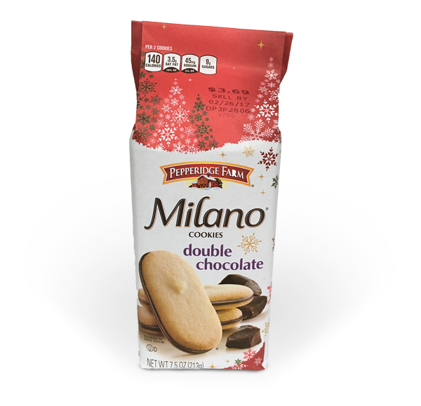
The festive packaging for Milano cookies couldn’t be ignored as we wandered down the snack aisle. The cookies inside the bag are familiar, but Christmas red replaces the standard purple top of the bag, and trees made of snowflakes line the now-snowy horizon. Snowflakes also fall down the side of the package to continue the seasonal feel.
Overall Thoughts
It’s safe to say cookies are the unofficial dessert of Christmas as they seem to show up in droves throughout the season. To make sure their cookies aren’t forgotten behind grandma’s gingerbread, Pepperidge Farm dressed up its Milanos in holiday cheer. The change makes an already elegant cookie feel more special and jump right into the shopping cart. Santa won’t mind a Milano or 2 mixed into that plate of sugar cookies, right?
Day 3: Trader Joe’s Peppermint Hot Chocolate
Our Notes
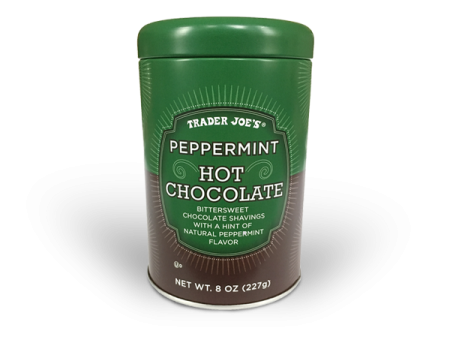
We found this tin of Peppermint Hot Chocolate hiding amongst other holiday goodies in one of the many seasonal displays at Trader Joe’s. Though the design doesn’t exactly exude holiday spirit, the badge-style logo combined with the tin container feels very giftable. Plus, its contents definitely give it a limited-time status.
Overall Thoughts
This product didn’t pop off the shelf for being decked out in candy canes or Christmas trees. Rather, it stood out for its simplicity. The badge-style logo and tin packaging elevate it to feel special, perfect for a little stocking stuffer. Maybe it will even make an appearance at this year’s IN Secret Santa gift exchange.
Day 2: Kemps Skim Milk
Our Notes
While browsing the dairy aisle for the traditional eggnog and festive creamers, we were surprised to stumble upon Christmas packaging in the milk section. Milk is such a staple item that you might not even notice the label change if you’re not looking for it. Here, the grassy fields are replaced by snow, and the Kemps cow is adorned in Santa garb and holding a sign that reads, “Official milk of Santa”.
Overall Thoughts
Because shoppers are accustomed to milk’s color-coding system, a jug of milk has very little flexibility to dress up for Christmas. Kemps had a small window of opportunity and really milked it for all it’s worth by taking ownership as the official milk of Santa. Adding Santa may not have a big impact on holiday sales for this staple grocery item, but it does succeed in making a relevant connection with shoppers.
Day 1: Ritz Crackers
Our Notes
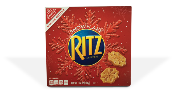
At a quick glance, Ritz doesn’t stand out for its limited edition seasonal packaging. Instead, a snowflake-themed box maintains the iconic Ritz Red that we see year-round. We also noted that snowflakes read as “seasonal” rather than “holiday” or “Christmas”.
Overall Thoughts
Retaining the Ritz Red as the core asset ensures familiarity with brand loyalists. Buyers know what they can expect with the bonus of a festive-shaped, entertaining-worthy cracker. Plus, choosing snowflakes versus Santa extends the life of the packaging past Christmas and New Year’s, especially here in MinneSNOWta.

